Use network style in Python
The network data tuned by the visualization can be posted back to Python. The visualization function can actually return two dictionaries, the first containing information about the stylized network, the second containing information about the visualization control configuration.
Start a visualization like this
import networkx as nx
import netwulf as nw

G = nx.barabasi_albert_graph(100,2)

stylized_network, config = nw.visualize(G)
A visualization window is opened and the network can be stylized. Once you’re done, press the button Post to Python.
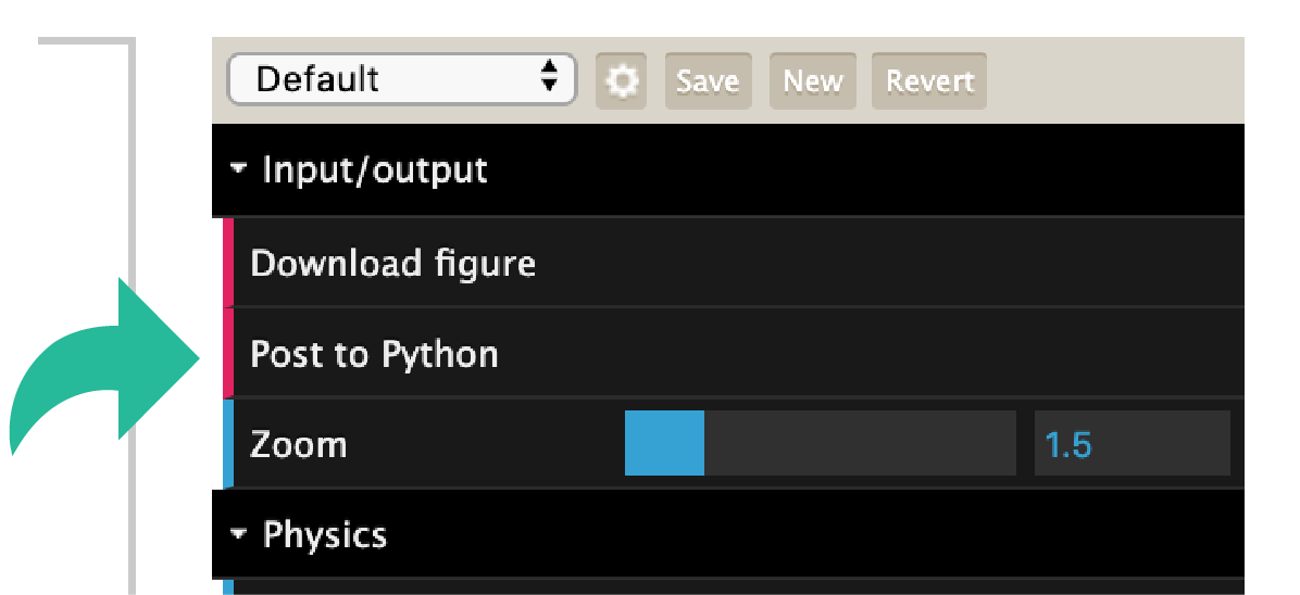
Pressing this button will pipe the data back to Python and close the browser
The Python kernel is busy until either Post to Python is clicked or a
KeyboardInterrupt signal is send (manually or using the Stop-Button
in a Jupyter notebook).
The returned stylized network dictionary will contain all the necessary information to reproduce the figure. It will look something like this.
stylized_network = {
    'xlim': [0, 833],
    'ylim': [0, 833],
    'linkColor': '#7c7c7c',
    'linkAlpha': 0.5,
    'nodeStrokeColor': '#000000',
    'nodeStrokeWidth': 0.75,
    'links': [
        {'source': 0, 'target': 2, 'width': 3},
        {'source': 0, 'target': 3, 'width': 3},
        {'source': 0, 'target': 4, 'width': 3},
        {'source': 1, 'target': 2, 'width': 3},
        {'source': 1, 'target': 3, 'width': 3},
        {'source': 1, 'target': 4, 'width': 3}
    ],
    'nodes': [
        {'id': 0,
         'x': 436.0933431058901,
         'y': 431.72418500564186,
         'radius': 20,
         'color': '#16a085'},
        {'id': 1,
         'x': 404.62184898400426,
         'y': 394.8158724310507,
         'radius': 20,
         'color': '#16a085'},
        {'id': 2,
         'x': 409.15148692745356,
         'y': 438.08415417584683,
         'radius': 20,
         'color': '#16a085'},
        {'id': 3,
         'x': 439.27989436871223,
         'y': 397.14932001193233,
         'radius': 20,
         'color': '#16a085'},
        {'id': 4,
         'x': 393.4680683212157,
         'y': 420.63184247673917,
         'radius': 20,
         'color': '#16a085'}
    ]
}
Furthermore, the configuration dictionary which was used to generate this figure will resemble
default_config = {
    # Input/output
    'zoom': 1,
    # Physics
    'node_charge': -45,
    'node_gravity': 0.1,
    'link_distance': 15,
    'link_distance_variation': 0,
    'node_collision': True,
    'wiggle_nodes': False,
    'freeze_nodes': False,
    # Nodes
    'node_fill_color': '#79aaa0',
    'node_stroke_color': '#555555',
    'node_label_color': '#000000',
    'display_node_labels': False,
    'scale_node_size_by_strength': False,
    'node_size': 5,
    'node_stroke_width': 1,
    'node_size_variation': 0.5,
    # Links
    'link_color': '#7c7c7c',
    'link_width': 2,
    'link_alpha': 0.5,
    'link_width_variation': 0.5,
    # Thresholding
    'display_singleton_nodes': True,
    'min_link_weight_percentile': 0,
    'max_link_weight_percentile': 1
}
If the visualization was started from a Jupyter notebook, a picture of the stylized network will appear in the cell below.
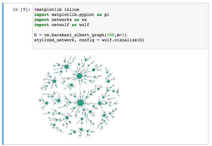
Stylized network in a Jupyter notebook.
In order to reproduce this visualization, you may want to call the visualization function again with, passing the produced configuration.
nw.visualize(G, config=config)